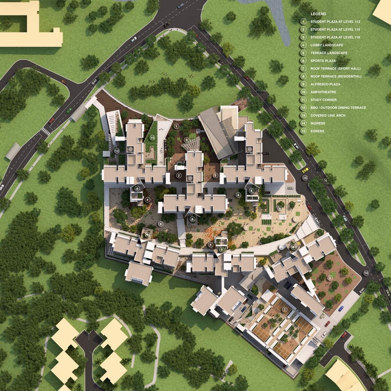
Overall site plan
Visualització © Guida Moseley Brown Architects, Australia
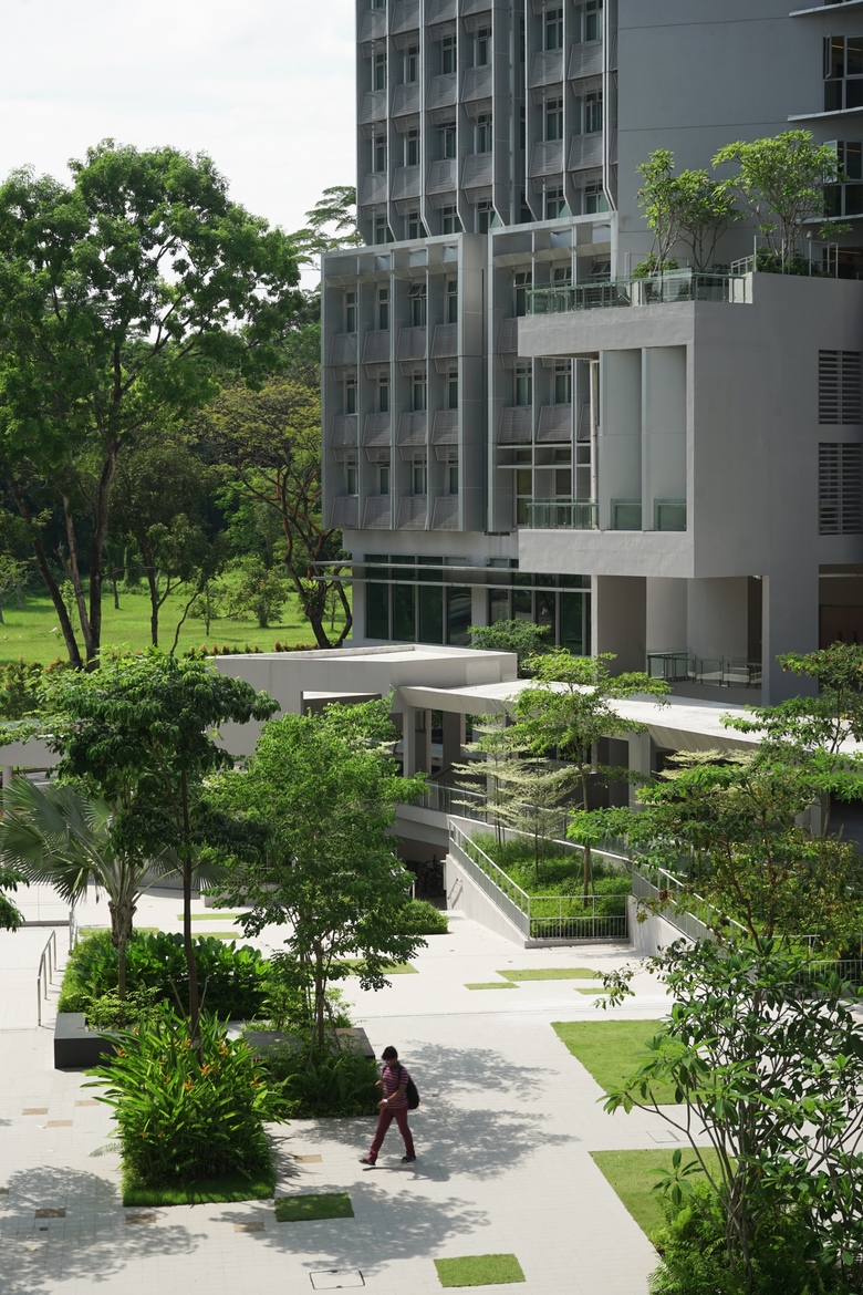
The North Hill development at Nanyang Technological University (NTU) are made up of six blocks of student hostels, cafeteria, gym and commercial spaces. The objective of the landscape design for the North Hill development was to establish vibrant communal spaces, plazas, and small-scale pocket spaces for the student interaction and integration.
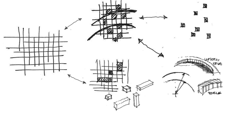
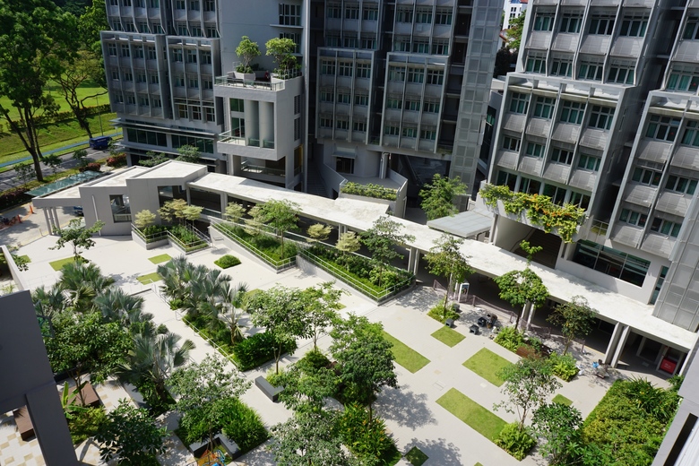
The overlapping of 3 form system; The Arcs, The Orthogonal Grid and The Modular Landscape Components, creates a dynamic organizational framework and structure for the landscape design. The Arcs were used to organize the buildings and levels. These are strong dynamic lines are juxtaposed on top of the static plaza grid. This intriguing intervention is best expressed by the arching architectural covered linkway at the main street plaza and the plaza promenade fronting the future pond.
The Orthogonal Grid paving pattern was derived from the building’s layout and modules. The grid seamlessly and connects both horizontal planes and vertical planes across the three plaza levels (level 113, level 115 and level 118)
The PPVC (Prefabricated Prefinished Volumetric Construction) system adopted by the project team for the building had inspired the creation of The Modular Landscape Components. The Modular Landscape Components are a series of design modules that act as “bits and parts” that could be easily prefabricated and fitted into the orthogonal grid system created for the landscape area. These landscape components comprise of seating platforms, planters, seating with lighting, small scale gazebo, water feature, accent planting, portable umbrellas, coloured floor tiles, etc.
The selection of the hardscape material was guided by the idea of utilizing the floor material as way of directing people to places, a built-in wayfinding element that is also a paving pattern. Three different tones of beige, brown floor tiles were selected for each level of the plaza. The density of the various tones and sizes provides clues to the user of his or her whereabouts around the development.
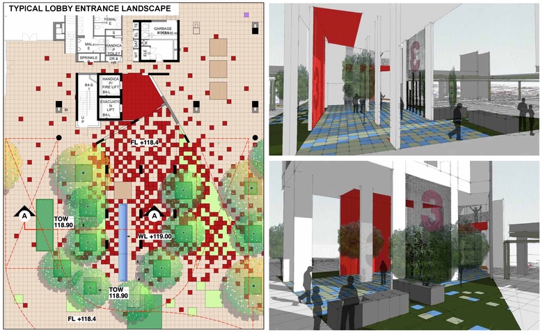
The entry lobby of the three student halls (each hall comprises of 2 residential blocks) was accentuated by different coloured floor tiles to allow users to use it as a quick recognition tool to get to their respective hall. The intensity of these colour tiles was strongest at the lift core area, and diminishing when it radiates away from the lift lobby.
The planting strategy is based on the re-creation of a native landscape of lowland rainforest species sustainable within this endemic environment. Fostering native flora and fauna will increase the landscape’s biodiversity. A native landscape is also easier to maintain and will give the campus a distinctive character and sense of place.
The fusion of landscape and architecture intermingling creates a spatial symbiosis between man and nature, resulting in a nurturing holistic environment that strikes the perfect equilibrium between study and play, rest and rejuvenation.
For this project, the Landscape Architect was responsible for all areas outside the buildings with the creation of the three levels plaza being the primary focus. For the landscape works, the landscape architect undertook full scope from Concept Design to Site Supervision.

The landscape framework was an overlapping of 3 essential elements - The Arcs, The Orthogonal Grid and The Modular Landscape Components
Dibuix © STX Landscape Architects

The 3-level landscape terraces were purposefully given a different tone of colour as a recognition of levels while acting as a way-finding tool. It is a functional and practical application of landscape language throughout the project.
Visualització © STX Landscape Architects

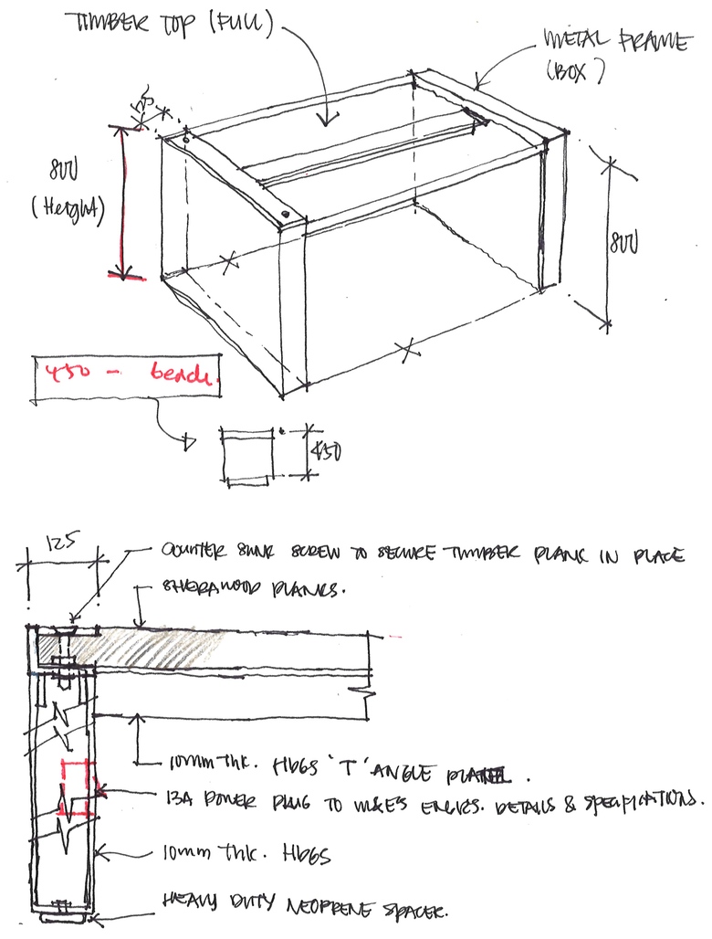
Conceptual sketch of one of the landscape component - study tables for the student
Dibuix © STX Landscape Architects

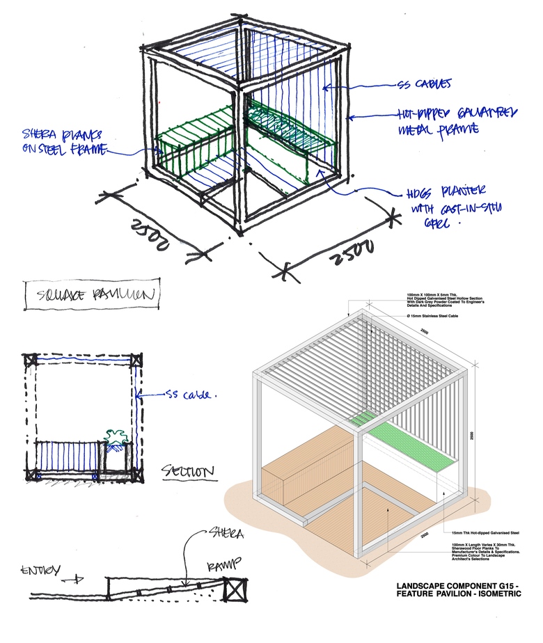
The trellis, a perfect square cube of 2.5m consist of a timber bench and planter for the climber to creep up and envelop the trellis with greenery
Dibuix © STX Landscape Architects

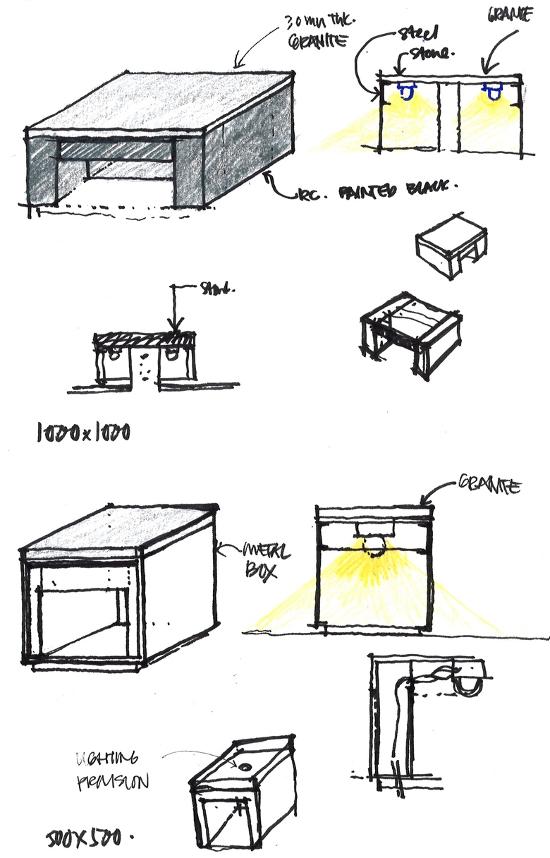
Conceptual sketch of 2 prototypes of the seat, one measuring 0.5x0.5m while the other one at 1x1m. Lighting idea was explored and incorporated in the seats
Dibuix © STX Landscape Architects

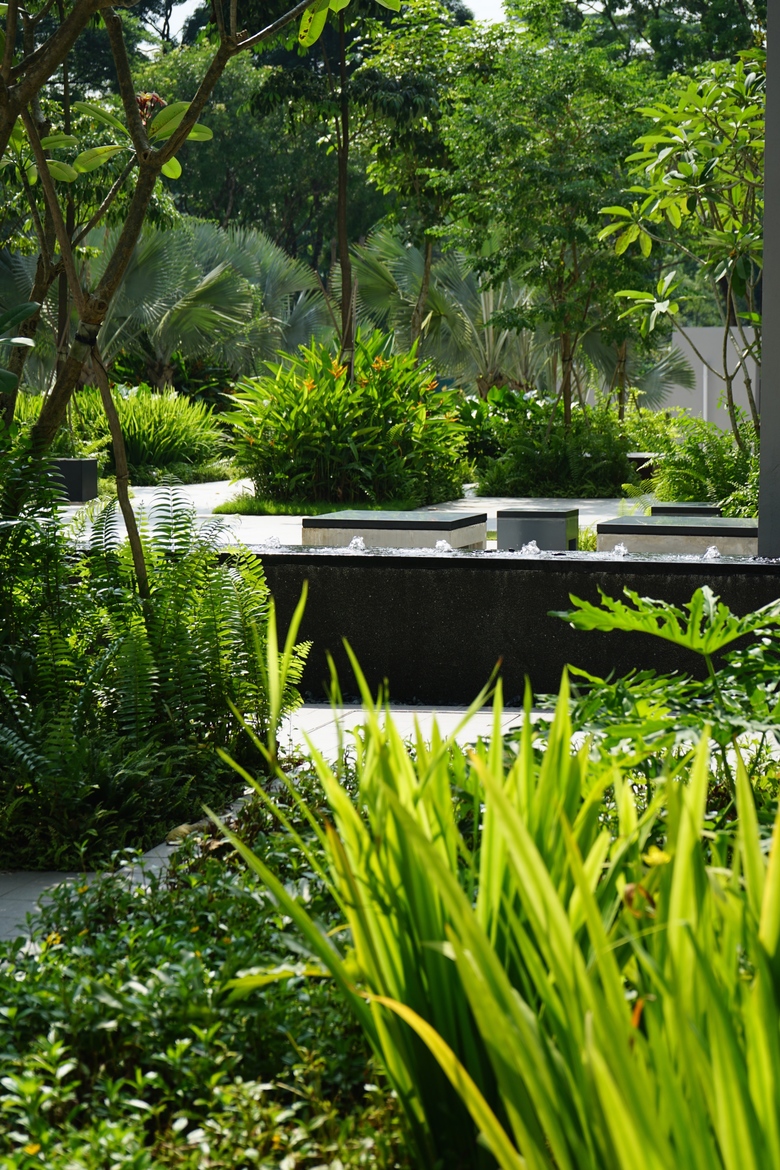
The raised water trough is placed at each Hall’s lobby amidst a garden setting to create a tranquil and serene retreat. Not only as a focal, it is also a transition place for students to socialise and unwind.
Dibuix © STX Landscape Architects

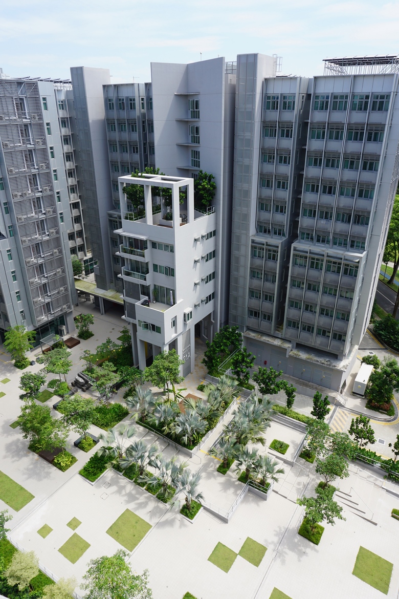
The Hall lobby is a vibrant transition space consist of random spots of coloured tiles, benches, seating platform, water feature and planting squares. It creates a strong geometrical link between landscape and architecture and instils a strong overall graphic identity
Visualització © STX Landscape Architects

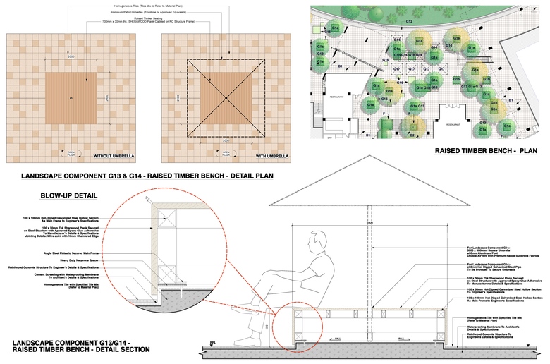
The timber benches adjacent to the canteen has a playful touch with umbrella holes provided for all of the benches. It allows the student to plug and stake the umbrellas freely as they wish
Dibuix © STX Landscape Architects

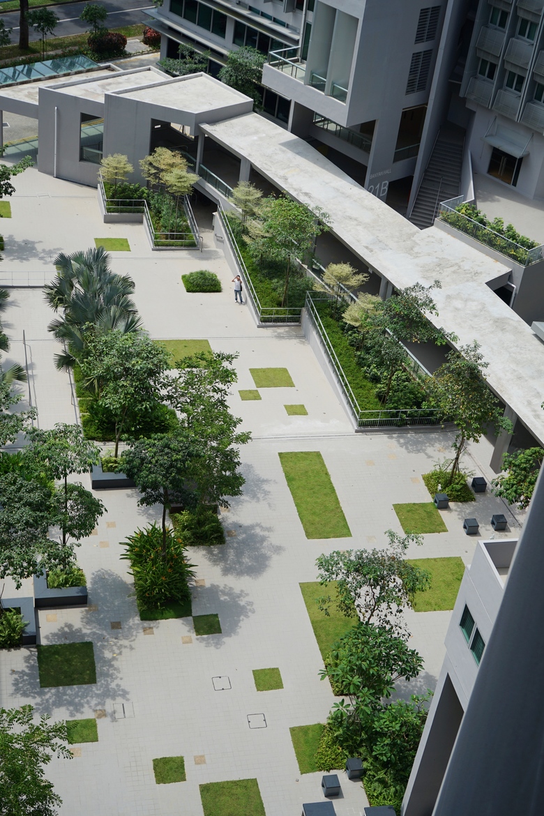
Aerial view overlooking the central pedestrian plaza and the ‘Arc’ linkway. The amalgamation of the 3 essential landscape frameworks is critical in creating a lively, vibrant and serene environment for the users to live, learn and interact
Fotografia © John Gollings

Modular Landscape Components such as benches, wooden platforms and planted squares were introduced at the student plaza adjacent to the canteen on the right, allowing users to feel psychologically at ease in an often-overstimulating space
Fotografia © John Gollings

Squares of greenery and various landscape components were incorporated with the staircases to mitigate level differences. While overcoming level issues, it creates intimate and social spaces for people to interact
Fotografia © John Gollings

Orthogonal Grid provides the framework for The Modular Landscape Component to "plug-in” at ease while creating a strong overall graphic identity
Fotografia © John Gollings

Detailing of the plaza were studied and examined from macro level to micro level. The various paving patterns and colour were utilised as a "way-finding" and "identity tool”. Trees were added strategically for a plaza which prioritises the pedestrians.
Fotografia © John Gollings

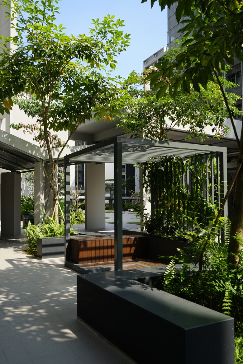
Framed by densely planted tropical plants, one of the Modular Landscape Component -The Trellis, creates outdoor spaces which foster a calm atmosphere
Fotografia © John Gollings

A sight of the pedestrian linkway beyond, with dense modular greenery at the foreground breaking the monotony and rigidness of an open plaza
Fotografia © John Gollings

The landscape design sought to seamlessly knit the boundaries of the landscape and the interior spaces of the buildings. The outcome is a multifunctional space which exudes a sense of timelessness while encouraging social interactions.
Fotografia © John Gollings

Aerial view from the sky terraces overlooking the hall lobby. The lobby entries with various landscape components were an essential transition area at the plaza. They provide a vibrant and comfortable space for people to gather, relax, interact and enjoy.
Fotografia © John Gollings

The water features, vegetated squares and seats create a soothing environment for users to indulge in comfort amidst lush greeneries.
Fotografia © STX Landscape Architects
